Infographics
The Scenic Route
This is something all students can relate to. It shows the process of creative work, self-doubt, procrastination, failure and express routes to success. It is successful because the this road map is like a twisted mind, you go back and forth and make detours for success.
Donations to German Parties
This graphic is interactive and it shows the major German parties, CDU, FDP, SPD, CSU, and 7 smaller parties as well as major private companies. By scrolling over the parties connections to private held companies become visible. The thicker the line connection the two, the more donations were received. Furthermore a little text pops up explaining the exact amount of the donation and their variation over the last couple of years.
It is a very clear, easy structured infographic. By only looking at the whole image, with all connections showing it is only beautiful but you cannot get information out of it. By making it interactive and isolating the information, it is very easy to read.
The World Map of Fear
This map is similar to the party donations. It is also interactive and isolates information. However this one is like a seismographic map at an earthquake. The x-axis shows the years while the intensity of the fear. All fears have different colors, like the bird flue and the Millennium Bug. What however makes this graphic bad, is that there is no clue how they measured the intensity of the fear. What is the scale? What kind of information was used? It says it uses “estimated total death” but I don’t think that’s a sufficiently good measurement.
The History of the Super Bowl
Especially during Super Bowl weekend this was a very popular graphic. It combines a lot of information on one page and it is visually appealing without distorting the information. It uses the football helmets to show which team won most titles, photos to display the coaches with most appearances and the Super Bowl Trivia. It is an interactive and fun graphic. The colors are well chosen and a football fanatic doesn’t even have to read much for understanding it.
Facebook vs. Twitter
This graphic shows the most popular and famous social networking sites and their followers and activities. It shows both social media tools in a circle, how many people are aware of it, how many people use it, how much do their users earn etc. The colors, the two different shades of blue, make the reader immediately recognize that it is Facebook and Twitter. Both circles contain the same information, which makes it easy to compare the two.
Pick Your Cupid
This infographic might not one be per se, but it is really funny. It transforms the old fashioned cupid into modern roles, like the fashionista cupid, the desperate cupid or the overachiever cupid.
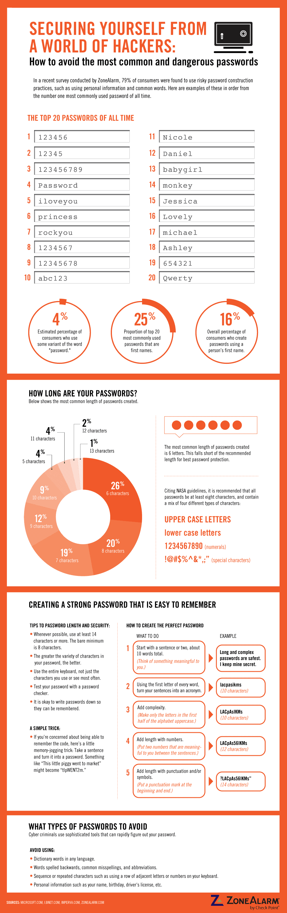
The Most Common and Dangerous Passwords
Thanks to this graphic I now know how to hack many Internet users’ accounts. I like how they displayed the most used passwords in fields that look like common fields in which to enter passwords. However this is a very boring beginning for such a graphic, maybe they could have used a word cloud to make it more interactive and visually appealing. Great are the do’s and don’ts when creating a password and the instructions. All in all I think they could have done a better job in making it appealing and make the reader have to read less.

-")

